Abigail's Design Portfolio
Friday, March 4, 2011
Tofu Branding
The goal of this project was to create a brand and create letterhead, a business card, a logo, advertising material, a brochure, and packaging. I decided to create a tofu brand because there are not (and definitely were not at this time) many creative branding ideas for tofu. I was also vegan when I was creating this advertising and was in tune to how limited some options can be for a vegan diet. Inside my brochure every page is dedicated to a different flavor of tofu that this brand produces and inside the packaging of the tofu is an innovative and exciting recipe that uses the tofu with the flavor that is in that box. In my advertising pieces I compared the quality of this tofu to the perfected art, the timeless art, and the art that cannot be rushed, like origami.
Monday, February 28, 2011
Enhanced Lyrics
I have to say my music taste spans nearly all genres. Ever since I lived in Barcelona I have been pretty partial to house music, I've rapped a few Biggie songs in my day, and I have to admit, I own some country music, ( I go to school in Virginia, what can I say) but one of my favorite artists will always be Manu Chao (also a big fan of Barcelona). One of my favorite songs of his is "Senegal Fast food". For this project I wanted the font to be clear and to the point since the song is in French. Due to the nature of the song I wanted the letters to be as interconnected as possible without becoming confusing. I wanted to represent the way that all the countries mentioned are separate, but are connected in so many ways, by the passing of time and the (generally) shared desire for something better, paradise.
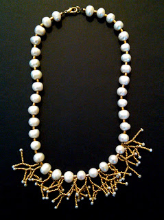
Pearl and Gold Necklace
I designed this necklace in the summertime when I wanted something a little bit dressy, but not too formal to wear with nearly any outfit during the day or into the night. I strung the pearls and then on thread I strung the small gold branches at the bottom. I used a wire needle on the end of my thread to help string the beads and went back through each branch many times to create new branches that grew out from one another. Overall, one of my favorite pieces to date.
Orange and Purple Necklace
I have always been extremely interested in fashion. Nearly all of the websites saved on my computer are fashion blogs or my favorite stores and I could easily spend all day just looking through them (scary, isn't it). Naturally, I enjoy making my own jewelry. One day when I was at an incredible bead store in Baltimore, I found the purple stones (seen above) that I knew I needed to use. I also bought the orange glass beads and already owned the other beads and the pearls. When I got home I did not make a plan and began stringing the orange beads. I strung them so they went around the first green bead in the center. From this point, I created the center piece, adding whatever I thought looked interesting and worked outward. I then created the left side and made the right side to match. I strung it all together and voila.
Tuesday, February 22, 2011
Text Templates
Here I created templates to represent every type style (however I only posted a few examples). I displayed each type of text in different sizes, with different leading, every letter of the alphabet in lowercase and uppercase, and some facts about the type. I chose the color palette because I felt it was modern and light.
Typography Diagrams
For this project I designed two typography diagrams. Both diagrams highlight the basic terms of typography in different ways. The project that is first listed is more intimate, as the reader has to be close to the design in order to receive the information. I liked the idea of creating a graphic image as the focus of the layout and listing the definitions underneath. In the second project, I created a diagram that could be used more as a poster.
Expressive Fonts
Continuing with my exploration of type, I have completed a quick study of how fonts can enhance a word and also what the word expresses.
Subscribe to:
Comments (Atom)


